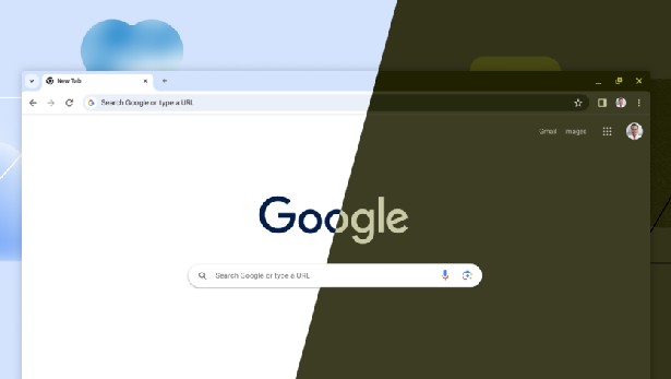
Google Chrome design in early 2024. What’s new and why?
03.01.24
Towards the end of last year, Google began updating the design of its Chrome browser. It received drastic changes and new functions. Updates now concern not only “internal” processes, but also affect many user elements in the interface. And this is an important UI update to the most popular browser in a long time.
In general, we are talking about the “major” version of the update – Google Chrome 120. There have already been a dozen additional amendments since the release of version 120. Updates arrive so quickly that when we wanted to check the next issue of the program collection and went to the help, we immediately received notifications about updating to a new version. And it was already set to 120.0.6099.130.
The Chrome version 120 update brings significant changes to the look of the desktop browser. Previously, it was already deployed on smartphones, and now the new look of the browser has become available on personal computers. The changes concern many aspects such as menus, dialog boxes, fonts, icons and colors.
Chrome 120 no longer supports Android 7 Nougat. Android users using devices running Nougat will not receive the update unless they update to Android 8 or later.
Concept
The Chrome interface has been radically redesigned in the Material You style, which is the current generation of the design system to replace the Material Design that came out of Android 12.
The new Chrome experience in version 120 has two goals: increasing content readability and deeper personalization. Changes include more rounded elements such as the toolbar, menus, tabs, and dialog boxes. New icons and additional color palettes have been introduced.
Google is rolling out new regular “proactive security checks” to desktop versions of Chrome. The announcement states that the browser is “checking for security issues” and users will receive warnings if potential issues are detected.
Google has also changed its permission suggestions service. It now sends URL-based signals to Google’s servers. In previous versions, administrators could prevent this behavior by using the SafeBrowsingProtectionLevel policy, but in Chrome 120 this policy is no longer in effect.
What’s new?
There are new colors and themes, not just light and dark modes. There is an option to automatically adapt the browser’s color scheme to the device’s color, which is similar to Android’s dynamic themes feature. Customization options are located in the “Customize Chrome” section.
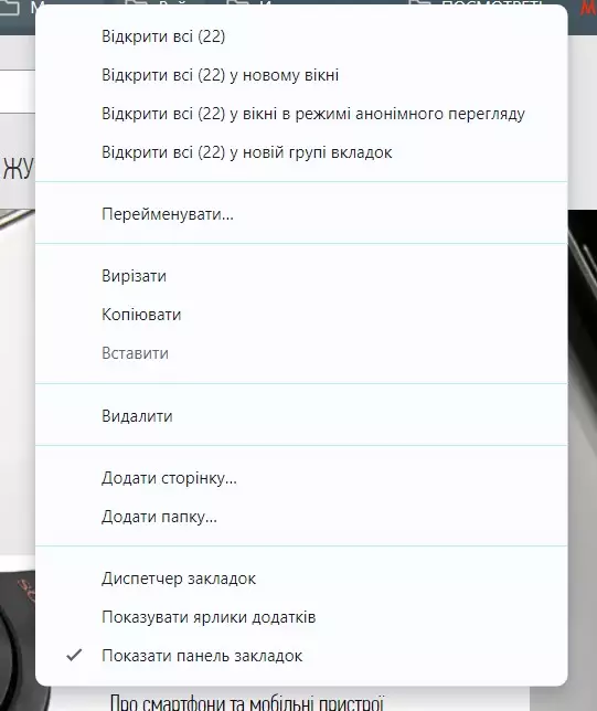
The updated main tool menu contains new icons and an expanded list of functions, including a profile switching menu. The Bookmarks sidebar has been redesigned, adding support for search, sorting options and editable tools, and bookmarks now have previews.

In the address bar there is no longer an icon for an HTTPS encryption lock, but a context menu with the ability to adjust the settings and permissions of a given site. This includes access to the camera, microphone, and location, as well as permission to view privacy and security-related items such as cookies and client.
Chrome 120 adds the ability to share passwords. This feature is integrated into Chrome’s default password manager and only works for Google Family group accounts. Members can share the same password with other group members. Google notes that shared passwords cannot be “updated or revoked by the sender”
The Bookmarks and Reading List section in mobile Chrome now has large images of saved links. They are now like apps, only bigger. There is no such thing on a PC, but to say that large icons are very helpful on a mobile device is not.

Impressions
To summarize, all that minimalism and unification to which we have been accustomed in recent years has come to naught and we are again in the era of designs that can be painted and the shapes of their elements changed. In our opinion, Google Chrome now looks overloaded. It may have been optimized and even added dynamic regulation of RAM load, but visually this is not the case.
The answer is to disable the new interface of desktop Google Chrome 120 and return to the old look. Suitable switches are located in the service section of the settings at chrome://flags. You can find them by searching and change the parameter value from Default to Disabled.
You need to disable the following options: Chrome Refresh 2023, Chrome WebUI Refresh 2023, Chrome Refresh 2023 Top Chrome Font Style, Customize Chrome Side Panel, Omnibox Expanded State Height, Omnibox Expanded State Shape. But, of course, over time this opportunity will disappear and the “new best” design will be irrevocably available to everyone.
hi-tech.ua project manager
Don't miss interesting news
Subscribe to our channels and read announcements of high-tech news, tes
Oppo A6 Pro smartphone review: ambitious

Creating new mid-range smartphones is no easy task. Manufacturers have to balance performance, camera capabilities, displays, and the overall cost impact of each component. How the new Oppo A6 Pro balances these factors is discussed in our review.
Acer Nitro Lite 16 (NL16-71G) laptop review: versatile and attractive

The 2025 Acer Nitro Lite 16 features an interesting case design, gaming accents, and proven components. Let’s take a closer look at its features.
Xiaomi Vision Gran Turismo supercar concept shown at MWC 2026 car concept MWC Xiaomi
Xiaomi Vision Gran Turismo supercar concept is built on a platform with 900V architecture based on silicon carbide (SiC)
Keychron K2 HE – 75% concrete keyboard keyboard
Keychron has released a limited edition of the K2 HE mechanical keyboard in 75% format


