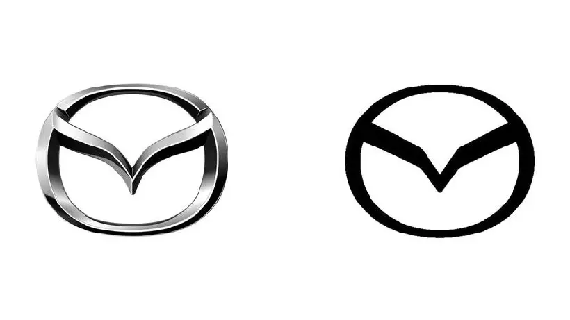
Mazda will have new logo first time in last 28 years
31.01.25
Mazda has decided to change its logo for the first time since 1997. The updated version is adapted for digital platforms: it has received a more concise and flat design, which should improve its perception on the screens of smartphones and other devices.
The company has not yet received an official statement, and at the moment its web resources continue to use the previous version of the emblem. However, the new logo was already registered by Mazda with the Japanese Patent Office in the summer of 2024, and images of the updated version appeared on the network.
The change did not affect the main elements of the brand name: the oval framing the stylized letter “M” was preserved. However, the lines have become clearer, and the color scheme has switched to a monochrome version. The rejection of the metal texture and complex multi-layering will make the emblem more readable in the digital environment.
Mazda’s decision fits into the general trend of simplifying corporate identity in the automotive industry. Previously, Volkswagen, Audi, BMW and Nissan carried out similar modernization of their logos, bringing the visual design in line with modern digital design standards.
Don't miss interesting news
Subscribe to our channels and read announcements of high-tech news, tes
Review of Samsung Galaxy A36 and Galaxy A56 smartphones: in a shadow of light

The Samsung Galaxy A36 and Galaxy A56 have equally good displays, large batteries, and support for software updates for 6 years. Let’s talk in more detail about what else makes them interesting.
Ajax Desktop – a new program for managing the system from a PC Ajax applications
Using Ajax Desktop, users can change the security mode of the entire system or individual zones, monitor the status of devices, and receive notifications.
ChatGPT is already used by 500 million users. Paid subscribers are already 20 million artificial intelligence business
Previously, OpenAI completed another round of financing, during which $40 billion was raised.


